All figures for manuscript

Modelling Asparagopsis nitrogen bioremediation efficiency in Australian coastal environments

Author

Tormey Reimer

Published

5 August 2026

Special display parameters for manuscript figures
prettyplot_MS <- function() {
  theme_classic() +
    theme(text = element_text(family = "serif", size = 12, colour = "black"),
          legend.position = "none",
          axis.title.y = element_text(vjust = 1.5),
          axis.title.x = element_text(vjust = 1.5),
          legend.title = element_blank())
}
env_plot_MS <- function() {
  prettyplot_MS() + theme(aspect.ratio = 0.55)
}

rm.x <- function(){
  theme(axis.text.x = element_blank(), axis.ticks.x = element_blank(), axis.title.x = element_blank())
  }
rm.y <- function(){
  theme(axis.text.y = element_blank(), axis.ticks.y = element_blank(), axis.title.y = element_blank())
  }

tlabel <- function(letter, x = 0, y = Inf) {
  annotate("text", label = letter, 
      x = x, y = y, hjust = 0.25, vjust = 1, 
      size = 4, family = "serif", fontface = "bold"
      )
}

rm(prettyplot, env_plot) # Removes previous display defaults

Figure 1: Map of all cells

Load in all the BARRA-R2 cells being used, with their coordinates.
cell_coords <- find_read(envi_data, "R2_cell_coords") %>% 
  mutate(state = factor(state, levels = states_ord)) %>% 
  dplyr::select(-layer)
Code to generate plot
cell_coords %>% 
  ggplot(aes(x = longitude, y = latitude, fill = state, label = cell_no)) +
  geom_raster() +
  geom_sf(data = ozmap_data(data = "states"), inherit.aes = F) +
  coord_sf(xlim = c(bounds[["AUS"]]["lonmin"], bounds[["AUS"]]["lonmax"]),
           ylim = c(bounds[["AUS"]]["latmin"], bounds[["AUS"]]["latmax"])) +
  # coord_sf(xlim = c(149.5, 151.5),
  #          ylim = c(-39, -37)) +
  # geom_text(size = 2.25) +
  scale_x_continuous(breaks = seq(100, 160, 5)) +
  scale_y_continuous(breaks = seq(-5, -45, -5)) +
  scale_fill_manual(values = states_pal) +
  labs(x = "Longitude", y = "Latitude") +
  prettyplot_MS() +
  theme(legend.position = "none")
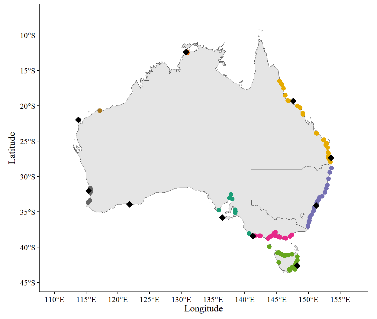
Figure 1: Map showing the area included this analysis, with colours indicating the different states. The ~60 km coastline buffer includes 13,207 cells approximately 12×12 km each.

Figure 2: Map of N sources

Load all nitrogen sources and locations
refstation_locations <- here() %>% 
  file.path("data", "nitrogen", "refstation_locations.parquet") %>% 
  arrow::read_parquet() %>% 
  rename(name = StationName) %>% 
  dplyr::select(-code)

outfall_locations <- here() %>% 
  file.path("data_raw", "national-outfall-database", "data-output", "outflow_site_locations.parquet") %>% 
  arrow::read_parquet() %>% 
  rename(lon = longitude,
         lat = latitude) %>% 
  dplyr::select(-state)

N_locations <- rbind(
  outfall_locations %>% mutate(type = "outfall"),
  refstation_locations %>% mutate(type = "refstation")
) %>% 
  mutate(name = as.character(name),
         state = case_when(
    type == "refstation" ~ NA,
    lon > bounds[["SAU"]]["lonmin"] & lon <= bounds[["SAU"]]["lonmax"] & 
      lat > bounds[["SAU"]]["latmin"] & lat <= bounds[["SAU"]]["latmax"]  ~ "SAU",
    lon > bounds[["QLD"]]["lonmin"] & lon <= bounds[["QLD"]]["lonmax"] & 
      lat > bounds[["QLD"]]["latmin"] & lat <= bounds[["QLD"]]["latmax"]  ~ "QLD",
    lon > bounds[["WAS"]]["lonmin"] & lon <= bounds[["WAS"]]["lonmax"] & 
      lat > bounds[["WAS"]]["latmin"] & lat <= bounds[["WAS"]]["latmax"]  ~ "WAS",
    lon > bounds[["WAN"]]["lonmin"] & lon <= bounds[["WAN"]]["lonmax"] & 
      lat > bounds[["WAN"]]["latmin"] & lat <= bounds[["WAN"]]["latmax"]  ~ "WAN",
    lon > bounds[["VIC"]]["lonmin"] & lon <= bounds[["VIC"]]["lonmax"] & 
      lat > bounds[["VIC"]]["latmin"] & lat <= bounds[["VIC"]]["latmax"]  ~ "VIC",
    lon > bounds[["NSW"]]["lonmin"] & lon <= bounds[["NSW"]]["lonmax"] & 
      lat > bounds[["NSW"]]["latmin"] & lat <= bounds[["NSW"]]["latmax"]  ~ "NSW",
    lon > bounds[["NTE"]]["lonmin"] & lon <= bounds[["NTE"]]["lonmax"] & 
      lat > bounds[["NTE"]]["latmin"] & lat <= bounds[["NTE"]]["latmax"]  ~ "NTE",
    lon > bounds[["TAS"]]["lonmin"] & lon <= bounds[["TAS"]]["lonmax"] & 
      lat > bounds[["TAS"]]["latmin"] & lat <= bounds[["TAS"]]["latmax"]  ~ "TAS",
    TRUE ~ NA
  ),
  state = factor(state, levels = states_ord)) %>% 
  relocate(state, .before = name) %>% 
  rename(latitude = lat,
         longitude = lon)

refstation_locations <- filter(N_locations, type == "refstation")
outfall_locations <- filter(N_locations, type == "outfall")
Code to generate plot
ggplot(N_locations, aes(x = longitude, y = latitude, color = state, shape = type)) +
  geom_sf(data = ozmap_data(data = "states"), inherit.aes = F) +
  coord_sf(xlim = c(bounds[["AUS"]]["lonmin"], bounds[["AUS"]]["lonmax"]),
           ylim = c(bounds[["AUS"]]["latmin"], bounds[["AUS"]]["latmax"])) +
  geom_point(size = 3.5) +
  scale_shape_manual(values = c(20, 18)) +
  scale_color_manual(values = states_pal, na.value = "black") +
  scale_x_continuous(breaks = seq(100, 160, 5)) +
  scale_y_continuous(breaks = seq(-5, -45, -5)) +
  labs(x = "Longitude", y = "Latitude") +
  prettyplot_MS() +
  theme(legend.position = "none")
Figure 2: Map showing the locations of recorded outfalls (points) and the IMOS reference stations (black diamonds) used in this analysis. Outfall data are coloured by state.

Figure 3: Sensitivity environmental conditions

Get data for sensitivity environmental conditions
culture_depths <- tar_read(culture_depths, store = spec_store)
factors <- tar_read(factors, store = spec_store)

state_input_timeseries <- envi_data %>% 
  list.files(full.names = T) %>% 
  str_subset("state_input_timeseries") %>% 
  purrr::map_dfr(arrow::read_parquet) %>% 
  filter(yday <= 365)

sens_cond <- file.path(spec_data, "sensitivity_conditions.parquet") %>% 
  arrow::read_parquet()
Code to generate plot
p1 <- sens_cond %>% 
  dplyr::filter(t <= 365) %>% 
  ggplot(aes(x = t, y = T_input, linetype = as.factor(T_level))) +
  geom_line(linewidth = 0.75) +
  geom_line(data = state_input_timeseries, aes(x = yday, y = T_input_mean, colour = state), linetype = "dotted", inherit.aes = F) +
  scale_y_continuous(breaks = seq(10, 35, 5), limits = c(10, 33.5)) +
  labs(y = expression("Temperature ("*degree*"C)")) +
  prettyplot_MS()

p2 <- sens_cond %>% 
  dplyr::filter(t <= 365 & T_level == 1) %>% 
  ggplot(aes(x = t, y = I_input)) +
  geom_line(linewidth = 0.75) +
  geom_line(data = state_input_timeseries, aes(x = yday, y = I_input_mean, colour = state), linetype = "dotted", inherit.aes = F) +
  scale_y_continuous(breaks = seq(0, 700, 100), limits = c(0, 660)) +
  labs(y = expression("Irradiance ("*mu*"mol m"^-2*" s"^-1*")")) +
  prettyplot_MS()

p3 <- sens_cond %>% 
  dplyr::filter(t <= 365 & T_level == 1) %>% 
  ggplot(aes(x = t, y = U_input)) +
  geom_line(linewidth = 0.75) +
  geom_line(data = state_input_timeseries, aes(x = yday, y = UV_input_mean, colour = state), linetype = "dotted", inherit.aes = F) +
  scale_y_continuous(breaks = seq(0, 0.6, 0.1), limits = c(0, 0.575)) +
  labs(y = expression("Water velocity (m"^-1*" s"^-1*")")) +
  prettyplot_MS()

p4 <- sens_cond %>% 
  dplyr::filter(t <= 365 & T_level == 1) %>% 
  ggplot(aes(x = t, y = S_input)) +
  geom_line(linewidth = 0.75) +
  geom_line(data = state_input_timeseries, aes(x = yday, y = S_input_mean, colour = state), linetype = "dotted", inherit.aes = F) +
  scale_y_continuous(breaks = seq(33.1, 36.8, 0.3), limits = c(34, 36.11)) +
  labs(y = expression("Salinity (g L"^-1*")")) +
  prettyplot_MS()

pdata1 <- sens_cond %>% 
  dplyr::filter(t <= 365 & T_level == 1) %>% 
  mutate(Ni_input = set_units(Ni_input, "mg m-3") %>% set_units("umol L-1") %>% drop_units(),
         Am_input = set_units(Am_input, "mg m-3") %>% set_units("umol L-1") %>% drop_units())
pdata2 <- state_input_timeseries %>% 
  mutate(Ni_input_mean = set_units(Ni_input_mean, "mg m-3") %>% set_units("umol L-1") %>% drop_units(),
         Am_input_mean = set_units(Am_input_mean, "mg m-3") %>% set_units("umol L-1") %>% drop_units())

p5 <- pdata1 %>% 
  ggplot(aes(x = t, y = Ni_input)) +
  geom_line(linewidth = 0.75) +
  geom_line(data = pdata2, aes(x = yday, y = Ni_input_mean, colour = state), linetype = "dotted", inherit.aes = F) +
  scale_y_continuous(breaks = seq(0, 5, 0.5), limits = c(0, 3)) +
  labs(y = nitrate_lab, x = "Day of the year") +
  prettyplot_MS()

p6 <- pdata1 %>% 
  ggplot(aes(x = t, y = Am_input)) +
  geom_line(linewidth = 0.75) +
  geom_line(data = pdata2, aes(x = yday, y = Am_input_mean, colour = state), linetype = "dotted", inherit.aes = F) +
  scale_y_continuous(breaks = seq(0, 10, 0.1), limits = c(0, 0.5)) +
  labs(y = ammonium_lab, x = "Day of the year") +
  prettyplot_MS()

plot_grid(
  plot_grid(
    p1 + rm.x() + tlabel("A"), 
    p2 + rm.x() + tlabel("B"), 
    p3 + rm.x() + tlabel("C"), 
    p4 + rm.x() + tlabel("D"), 
    p5 + tlabel("E"), 
    p6 + tlabel("F"), 
    ncol = 2, align = "hv"
  ),
  ggdraw(),
  # draw_label("Day of the year", size = 12, fontfamily = "serif"),
  ncol = 1,
  rel_heights = c(0.95, 0.05)
)
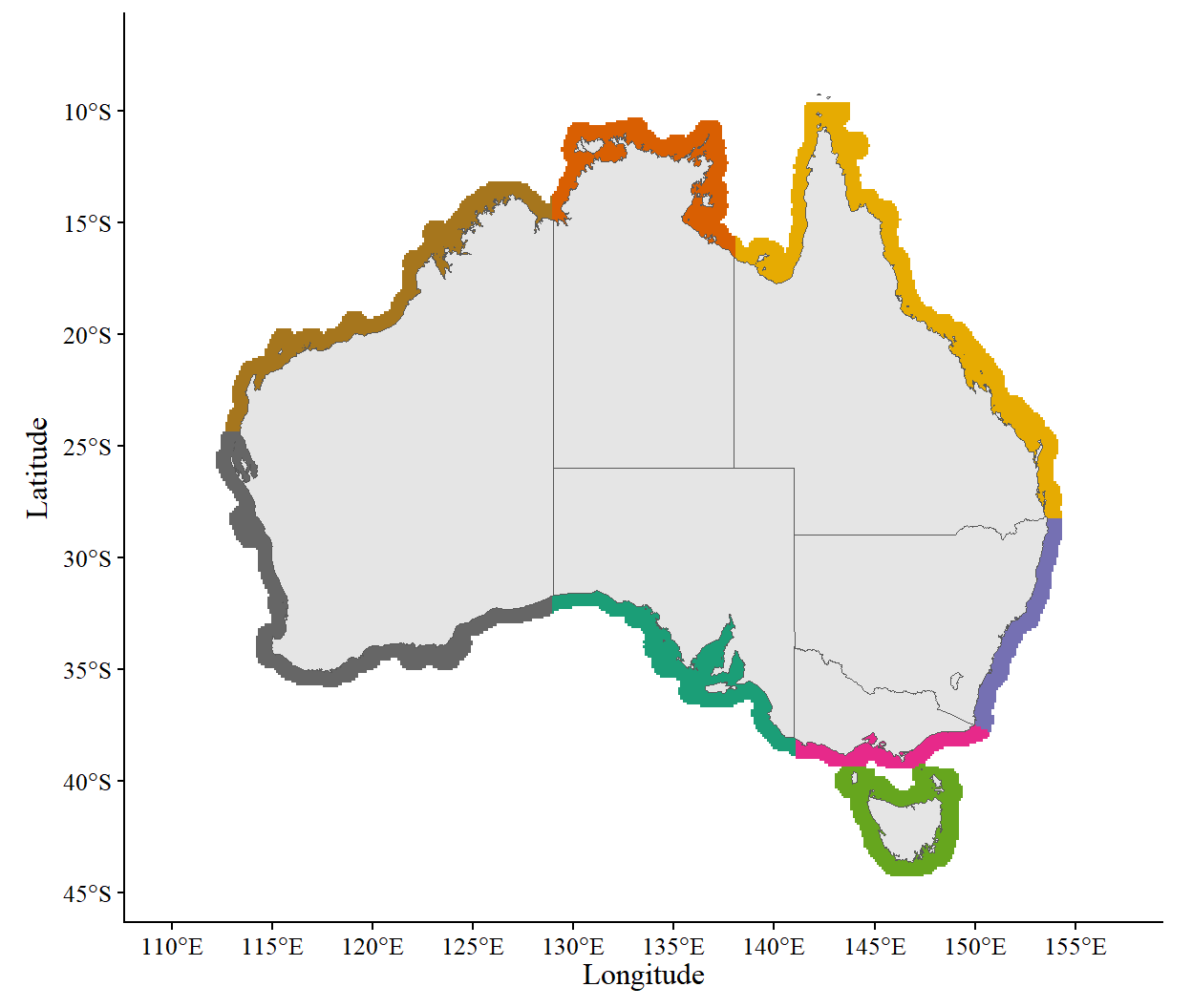
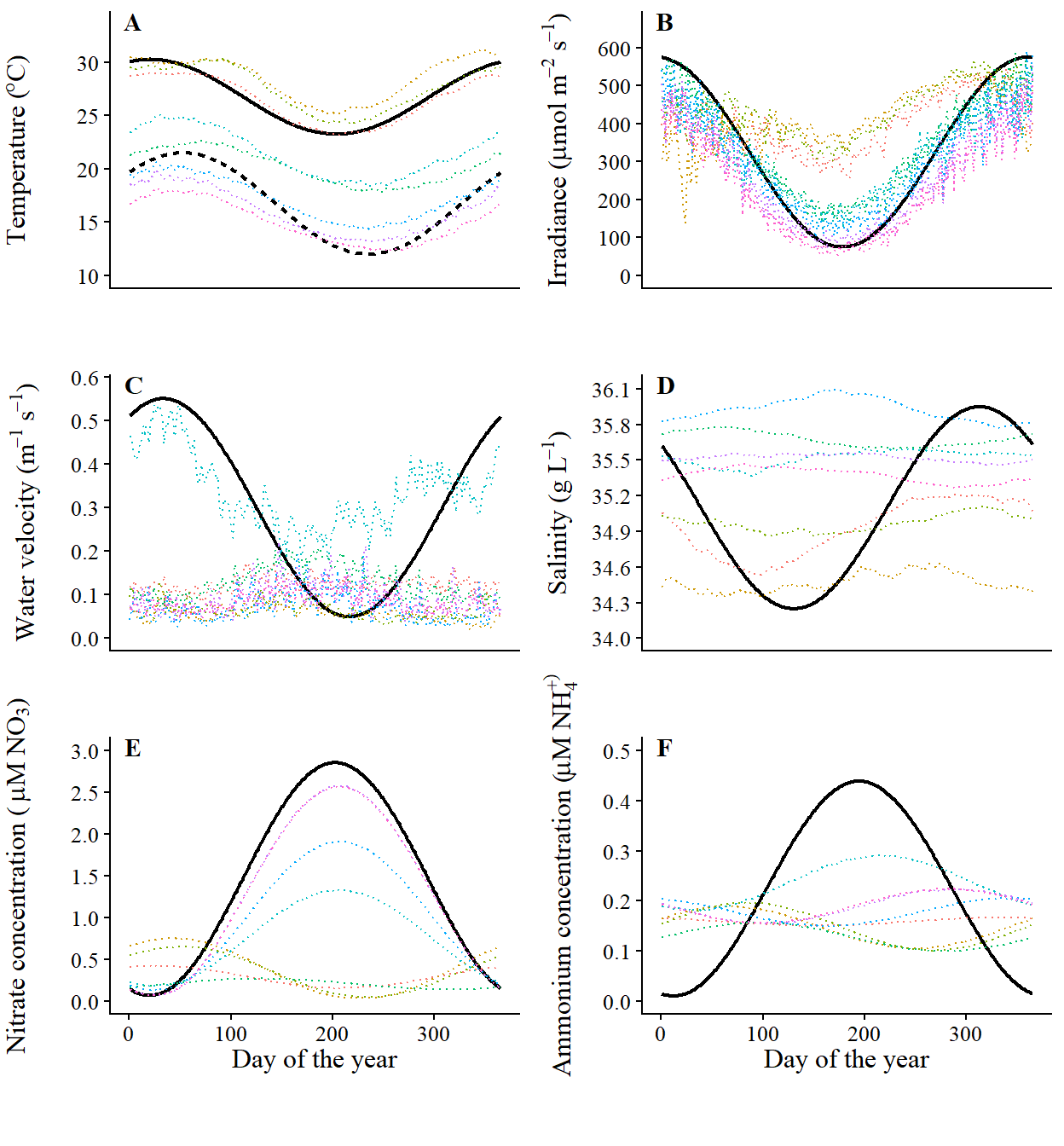
Figure 3: Input curves for the model parameter sensitivity runs. Environmental inputs included high (solid) and low (dashed) temperatures (A), surface irradiance (B), water velocity (C), salinity (D), nitrate concentration (E) and ammonium concentration (F).

Figure 4: Simulated response curves

Code to generate plot
N_uptake <- file.path(spec_data, "N_uptake.parquet") %>% 
  read_parquet()
S_response <- file.path(spec_data, "S_response.parquet") %>% 
  read_parquet()
I_response <- file.path(spec_data, "I_response.parquet") %>% 
  read_parquet() %>% 
  mutate(depth_m = as.factor(depth_m))
T_response <- file.path(spec_data, "T_response.parquet") %>% 
  read_parquet() %>% 
  mutate(species = factor(species, 
                          levels = c("taxiformis", "armata"), 
                          labels = c("taxi", "arma")))

p1 <- ggplot(N_uptake, aes(x = uM, y = uptake_uM, linetype = form)) +
  geom_line(linewidth = 0.75) +
  labs(x = expression("Ambient concentration ("*mu*"M)"), y = expression("Uptake rate ("*mu*"mol gDW"^-1*"d"^-1*")")) +
  scale_y_continuous(breaks = seq(0, 3.5, 0.05), limits = c(0, 0.30)) +
  scale_x_continuous(breaks = seq(0, 30, 5), limits = c(0,25)) +
  prettyplot_MS() + 
  theme(aspect.ratio = 0.8)

p2 <- ggplot(T_response, aes(x = temp, y = Tlim, color = species)) +
  geom_line(linewidth = 0.75) +
  labs(x = expression("Temperature ("*degree*"C)"), y = "Relative growth") +
  scale_y_continuous(breaks = seq(0, 1, 0.2), limits = c(0,1)) +
  scale_x_continuous(breaks = seq(0, 40, 5), limits = c(0,35)) +
  prettyplot_MS() + 
  theme(aspect.ratio = 0.8)

p3 <- ggplot(I_response, aes(x = light, y = Ilim, linetype = as.factor(depth_m))) +
  geom_line(linewidth = 0.75) +
  facet_wrap(facets = vars(species)) +
  labs(x = expression("Surface light (PPFD)"), y = "Relative growth") +
  scale_y_continuous(breaks = seq(0, 1, 0.2), limits = c(0,1)) +
  scale_linetype_manual(values = c("solid", "dashed", "dotdash", "dotted")) +
  prettyplot_MS() + 
  theme(aspect.ratio = 0.8, strip.text = element_blank())

p4 <- ggplot(S_response, aes(x = sali, y = Slim)) +
  geom_line(linewidth = 0.75) +
  labs(x = expression("Salinity (g L"^-1*")"), y = "Relative growth") +
  scale_y_continuous(breaks = seq(0, 1, 0.2), limits = c(0,1)) +
  scale_x_continuous(breaks = seq(0, 60, 5), limits = c(19,45)) +
  prettyplot_MS() + 
  theme(aspect.ratio = 0.8)

plot_grid(
  plot_grid(
    p1 + tlabel("A"), 
    p2 + tlabel("B") + theme(axis.title.y = element_text(vjust = 0.5)), 
    p3 + tlabel("C") + theme(axis.title.y = element_text(vjust = 0.5)),  
    p4 + tlabel("D", x = 19) + theme(axis.title.y = element_text(vjust = 0.5)), 
    ncol = 2, align = "hv"
  ),
  ncol = 1,
  rel_heights = c(0.95, 0.05)  # Adjust these values to control spacing
)
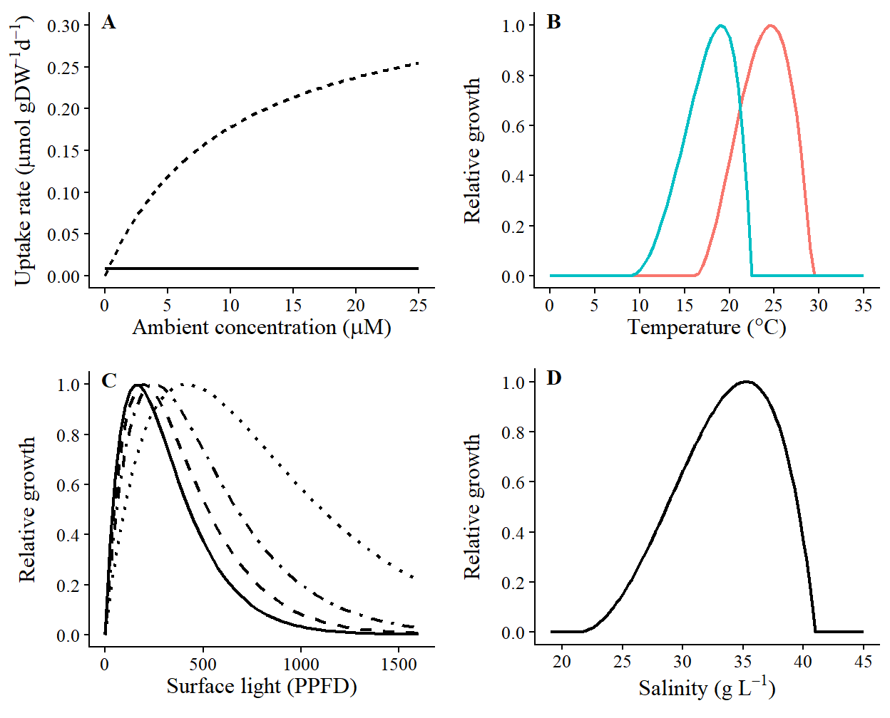
Figure 4: Simulated response curves to environmental variables in the growth model, including A) uptake rate of nitrate (solid line) and ammonium (dashed line), B) temperature response of A. armata (blue) and A. taxiformis (red), C) light response when grown at depths of 1 m (solid), 2 m (dashed), 5 m (dot-dashed) or 10 m (dotted), and D) salinity response.

Figure 5: N removal in ambient conditions

Get cell growth in ambient (normal) conditions
norm_growth_end <- file.path(runs_data, "cell_growth_end.parquet") %>% 
  read_parquet(mmap = T) %>% 
  merge(cell_coords, by = "cell_no")

# Total N removed at each harvest
norm_growth_end <- norm_growth_end %>% 
  mutate(
    value = TN_end - TN_start,
    value = case_when(value == 0 ~ NA, T ~ value),
    month = as.factor(month(parse_date_time(start, orders = "j"))),
    species = factor(species, levels = c("armata", "taxiformis"), labels = c("A. armata", "A. taxiformis"))
  )
Code to generate plot
norm_growth_end %>%
  mutate(value = case_when(value <= 0 ~ 0, T ~ value)) %>% 
  group_by(species, state, start) %>%
  reframe(
    mean = meanna(value),
    sd = sdna(value)
  ) %>%
  mutate(
    sd = case_when(sd > mean ~ mean, T ~ sd),
    state = factor(state, levels = states_ord, labels = states_lng)
  ) %>%
  ggplot(
    aes(
      x = start, y = mean, ymin = mean - sd, ymax = mean + sd,
      color = state, fill = state, linetype = species
    )
  ) +
  geom_line(linewidth = 0.75) +
  geom_ribbon(alpha = 0.25, linewidth = 0.25) +
  facet_wrap(facets = vars(state), ncol = 2) +
  # scale_y_continuous(breaks = seq(0, 150, 25), limits = c(0, 175), expand = c(0,0)) +
  scale_color_manual(values = states_pal) +
  scale_fill_manual(values = states_pal) +
  env_plot_MS() +
  labs(x = "Day of the year", y = expression("Total N removed (mg m"^-2 *")"))
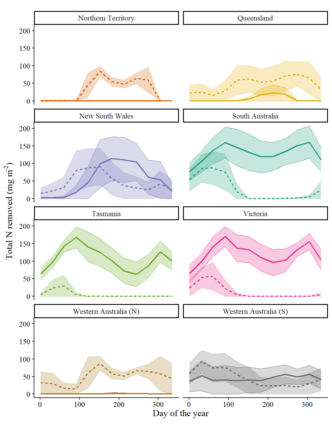
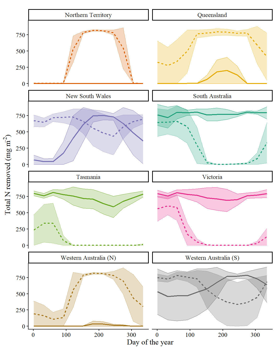
Figure 5: Nitrogen removal per month at harvest by Asparagopsis armata (solid lines) and Asparagopsis taxiformis (dashed lines) in the 12 monthly growth periods in each state in typical environmental conditions. Bold lines show mean values while shaded areas show mean ± standard deviation.

Figure 7: Ambient vs supplemented growth

Get total cell growth in ambient (normal) conditions
norm_growth_total <- norm_growth_end %>% 
  mutate(
    value_na = case_when(value <= 0 ~ NA, T ~ value),
    value_0s = case_when(value <= 0 ~ 0, T ~ value)
  ) %>% 
  group_by(state, species, cell_no, latitude, longitude) %>% 
  reframe(
    total = sumna(value),            # good growth months may be outweighed by bad growth months
    total_na = sumna(value_na),      # bad growth months are removed
    total_na = case_when(total_na == 0 ~ NA, T ~ total_na),
    total_0s = sumna(value_0s)       # bad growth months count as zeros
  )
Get cell growth in nitrogen supplemented conditions
supp_growth_end_raw <- file.path(runs_data, "cell_growth_supp_end.parquet") %>% 
  read_parquet(mmap = T) %>% 
  merge(cell_coords, by = "cell_no")

supp_growth_end <- supp_growth_end_raw %>% 
  mutate(
    value = TN_end - TN_start,
    value = case_when(value == 0 ~ NA, T ~ value),
    month = as.factor(month(parse_date_time(start, orders = "j"))),
    species = factor(species, levels = c("armata", "taxiformis"), labels = c("A. armata", "A. taxiformis"))
  )

supp_growth_total <- supp_growth_end %>% 
  mutate(
    value_na = case_when(value <= 0 ~ NA, T ~ value),
    value_0s = case_when(value <= 0 ~ 0, T ~ value)
  ) %>% 
  group_by(state, species, cell_no, latitude, longitude) %>% 
  reframe(
    total = sumna(value),            # good growth months may be outweighed by bad growth months
    total_na = sumna(value_na),      # bad growth months are removed
    total_na = case_when(total_na == 0 ~ NA, T ~ total_na),
    total_0s = sumna(value_0s)       # bad growth months count as zeros
  )
Code to generate plot
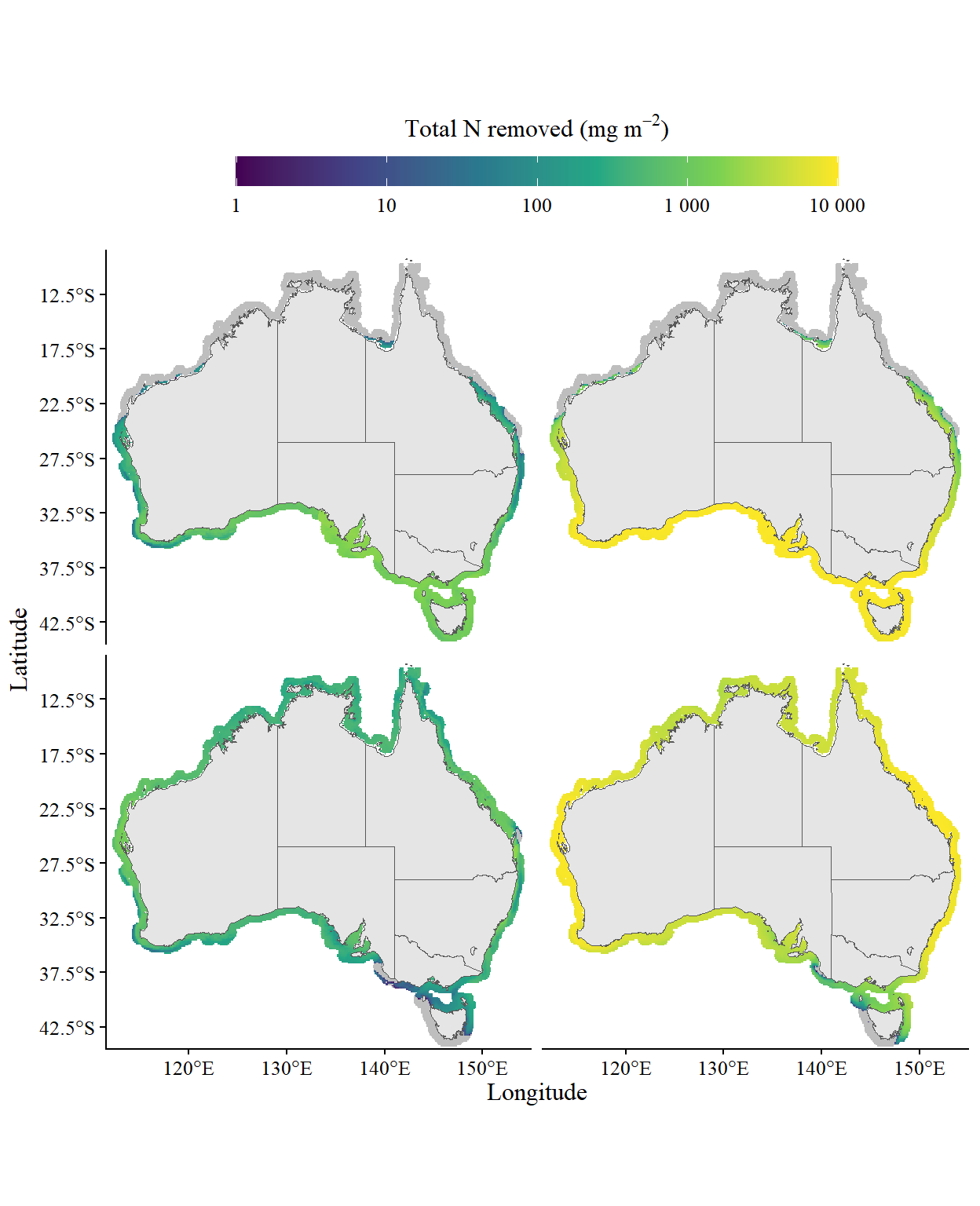
#    "Total nitrogen removal by A. armata (top: A, B) and A. taxiformis (bottom: C, D) summed across one year of typical environmental conditions (left: A, C) or with supplemented environmental conditions (right: B, D). Grey cells show areas where growth failed or where nitrogen removal was < 0 across the entire year."

all_growth_total <- rbind(
  norm_growth_total %>% mutate(scenario = "norm_conditions"),
  supp_growth_total %>% mutate(scenario = "supp_conditions")
)

all_growth_total %>%
  ggplot(aes(x = longitude, y = latitude, fill = total_na)) +
  geom_tile() +
  geom_sf(data = ozmap_data(data = "states"), inherit.aes = F) +
  coord_sf(xlim = c(111.5, 155), ylim = c(-44.5, -8.5), expand = F) +
  scale_x_continuous(breaks = seq(100, 160, 10)) +
  scale_y_continuous(breaks = seq(-2.5, -45, -5)) +
  scale_fill_viridis_c(
    limits = c(1, 10000),
    labels = scales::label_number(),
    trans = "log10",
    na.value = "grey",
    guide = guide_colorbar(
      title = expression("Total N removed (mg m"^-2 * ")"),
      barheight = 1,
      barwidth = 20,
      title.position = "top",
      title.hjust = 0.5
    )
  ) +
  labs(x = "Longitude", y = "Latitude") +
  facet_grid(rows = vars(species), cols = vars(scenario)) +
  prettyplot_MS() +
  theme(legend.position = "top", strip.text = element_blank(), strip.background = element_blank())
Figure 6

Figure 7: N removal in supplemented conditions

Get cell growth in supplemented conditions
supp_growth_end <- file.path(runs_data, "cell_growth_supp_end.parquet") %>% 
  read_parquet(mmap = T) %>% 
  merge(cell_coords, by = "cell_no")

# Total N removed at each harvest
supp_growth_end <- supp_growth_end %>% 
  mutate(
    value = TN_end - TN_start,
    value = case_when(value == 0 ~ NA, T ~ value),
    month = as.factor(month(parse_date_time(start, orders = "j"))),
    species = factor(species, levels = c("armata", "taxiformis"), labels = c("A. armata", "A. taxiformis"))
  )
Code to generate plot
supp_growth_end %>%
  mutate(value = case_when(value <= 0 ~ 0, T ~ value)) %>% 
  group_by(species, state, start) %>%
  reframe(
    mean = meanna(value),
    sd = sdna(value)
  ) %>%
  mutate(
    sd = case_when(sd > mean ~ mean, T ~ sd),
    state = factor(state, levels = states_ord, labels = states_lng)
  ) %>%
  ggplot(
    aes(
      x = start, y = mean, ymin = mean - sd, ymax = mean + sd,
      color = state, fill = state, linetype = species
    )
  ) +
  geom_line(linewidth = 0.75) +
  geom_ribbon(alpha = 0.25, linewidth = 0.25) +
  facet_wrap(facets = vars(state), ncol = 2) +
  # scale_y_continuous(breaks = seq(0, 150, 25), limits = c(0, 175), expand = c(0,0)) +
  scale_color_manual(values = states_pal) +
  scale_fill_manual(values = states_pal) +
  env_plot_MS() +
  labs(x = "Day of the year", y = expression("Total N removed (mg m"^-2 *")"))
Figure 7: Nitrogen removal per month at harvest by Asparagopsis armata (solid lines) and Asparagopsis taxiformis (dashed lines) in the 12 monthly growth periods in each state. Bold lines show mean values while shaded areas show mean ± standard deviation.

Supplementary figures

Load environmental timeseries
T_input <- file.path(envi_data, "cell_input_all") %>% 
  list.files(full.names = T) %>% 
  purrr::map(function(fnm) {
    fnm %>% arrow::read_parquet(col_select = c("cell_no", "state", "yday", "T_input"))
  }) %>% 
  bind_rows() %>% 
  mutate(state = factor(state, levels = states_ord, labels = states_lng))

I_input <- file.path(envi_data, "cell_input_all") %>% 
  list.files(full.names = T) %>% 
  purrr::map(function(fnm) {
    fnm %>% arrow::read_parquet(col_select = c("cell_no", "state", "yday", "I_input"))
  }) %>% 
  bind_rows() %>% 
  mutate(state = factor(state, levels = states_ord, labels = states_lng))

K_input <- file.path(envi_data, "cell_input_all") %>% 
  list.files(full.names = T) %>% 
  purrr::map(function(fnm) {
    fnm %>% arrow::read_parquet(col_select = c("cell_no", "state", "yday", "Kd_490"))
  }) %>% 
  bind_rows() %>% 
  mutate(state = factor(state, levels = states_ord, labels = states_lng))

S_input <- file.path(envi_data, "cell_input_all") %>% 
  list.files(full.names = T) %>% 
  purrr::map(function(fnm) {
    fnm %>% arrow::read_parquet(col_select = c("cell_no", "state", "yday", "S_input"))
  }) %>% 
  bind_rows() %>% 
  mutate(state = factor(state, levels = states_ord, labels = states_lng))

UV_input <- file.path(envi_data, "cell_input_all") %>% 
  list.files(full.names = T) %>% 
  purrr::map(function(fnm) {
    fnm %>% arrow::read_parquet(col_select = c("cell_no", "state", "yday", "UV_input"))
  }) %>% 
  bind_rows() %>% 
  mutate(state = factor(state, levels = states_ord, labels = states_lng))

Figure S1: Temperature

Code to generate plot
T_input_state <- T_input %>%
  group_by(state, yday) %>% 
  reframe(value = mean(T_input, na.rm = T),
          sd = sd(T_input, na.rm = T))

(
  p_input_state_av <- T_input_state %>% 
    ggplot(aes(x = yday, y = value, ymin = value-sd, ymax = value+sd, colour = state, fill = state)) +
    geom_line(linewidth = 0.75) +
    geom_ribbon(alpha = 0.35, linewidth = 0.25) +
    facet_wrap(facets = vars(state), ncol = 2) +
    scale_y_continuous(breaks = seq(0, 40, 5), limits = c(10, 35)) +
    scale_colour_manual(values = states_pal) +
    scale_fill_manual(values = states_pal) +
    env_plot_MS() +
    labs(x = "Day of the year", y = expression("Temperature ("*degree*"C)"))
)
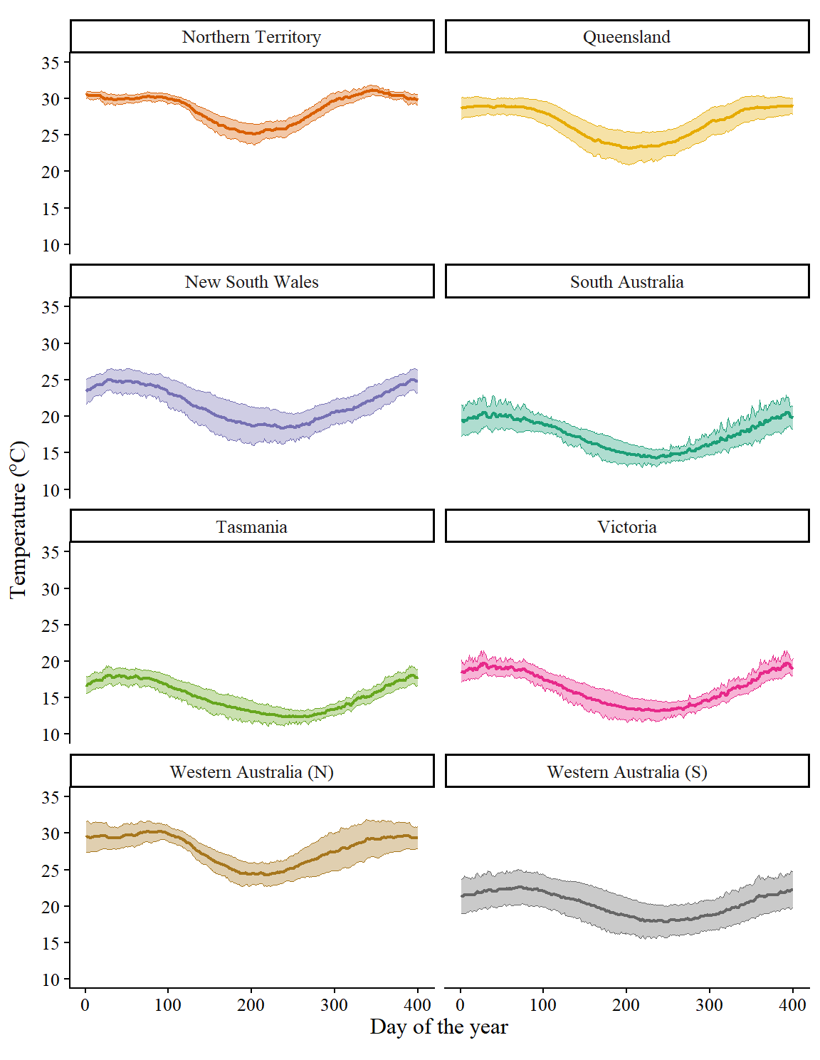
Figure 8: Summary of temperature values across the year within each state, averaged across 2019-2023. Bold lines show the mean across all cells within each state while ribbons show the standard deviation between cells.

Figure S2: Light

Code to generate plot
I_input_state <- I_input %>%
  group_by(state, yday) %>% 
  reframe(value = mean(I_input, na.rm = T),
          sd = sd(I_input, na.rm = T))

p_input_state_av %+% I_input_state +
  scale_y_continuous(breaks = seq(0, 1600, 150), limits = c(0, 650)) +
  labs(x = "Day of the year", y = expression("Irradiance (photons m"^-2*" s"^-1*")")) 
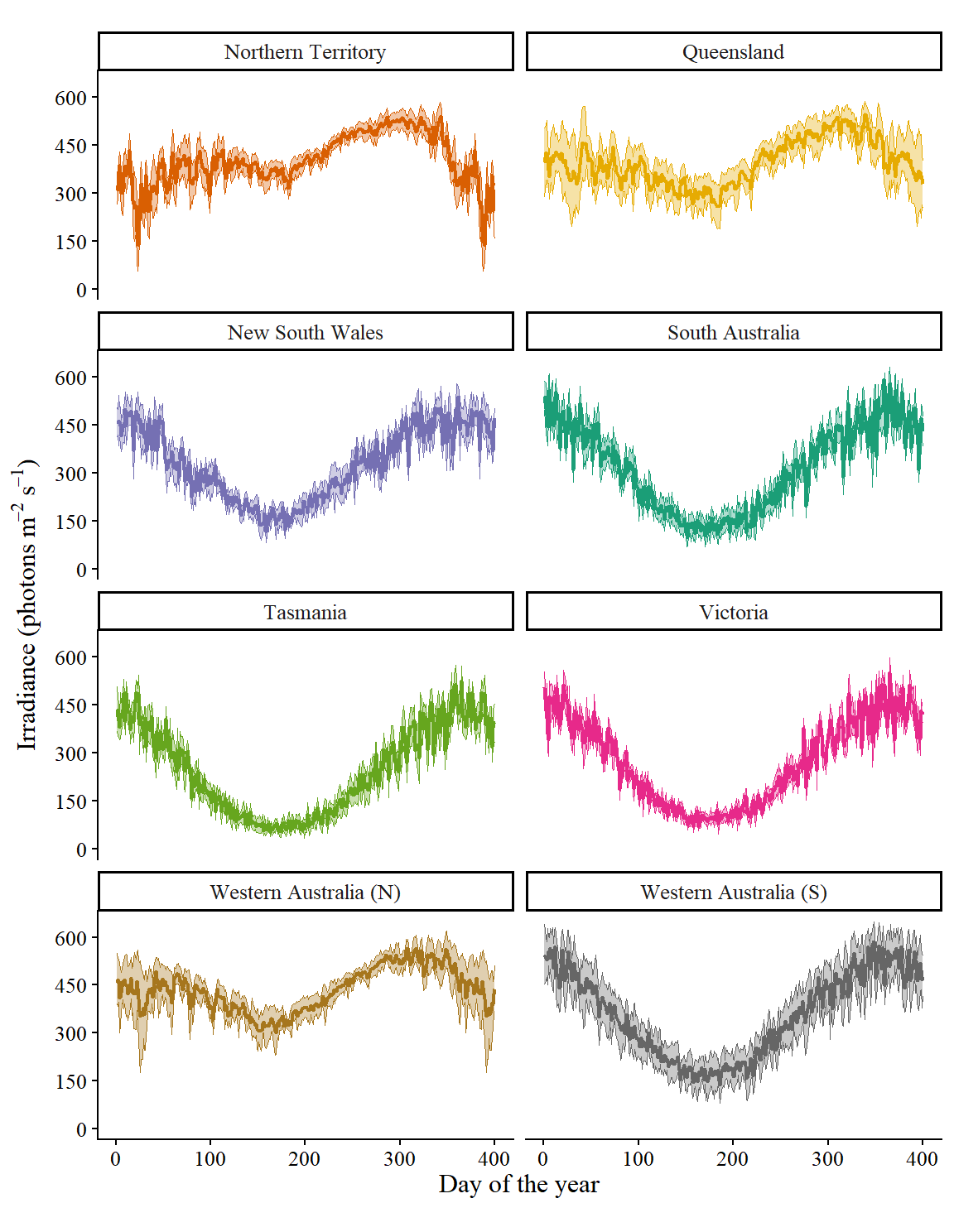
Figure 9: Summary of irradiance values across the year within each state, averaged across 2019-2023. Bold lines show the mean across all cells within each state while ribbons show the standard deviation between cells.

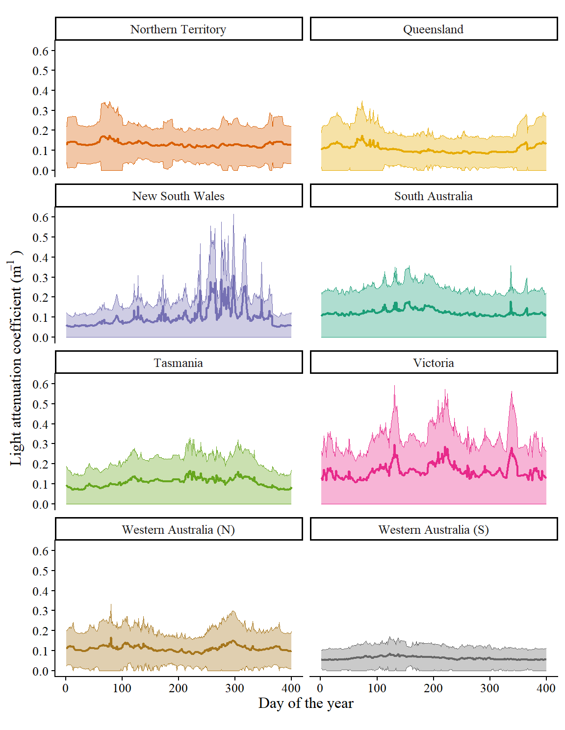
Figure S3: Light attenuation

Code to generate plot
K_input_state <- K_input %>%
  group_by(state, yday) %>% 
  reframe(value = mean(Kd_490, na.rm = T),
          sd = sd(Kd_490, na.rm = T)) %>% 
  mutate(sd = case_when(sd > value ~ value, T ~ sd))

p_input_state_av %+% K_input_state +
  scale_y_continuous(breaks = seq(0, 0.7, 0.1), limits = c(0, 0.62)) +
  labs(x = "Day of the year", y = expression("Light attenuation coefficient (m"^-1*" )"))
Figure 10: Summary of light attenuation coefficient values across the year within each state, averaged across 2019-2023. Bold lines show the mean across all cells within each state while ribbons show the standard deviation between cells.

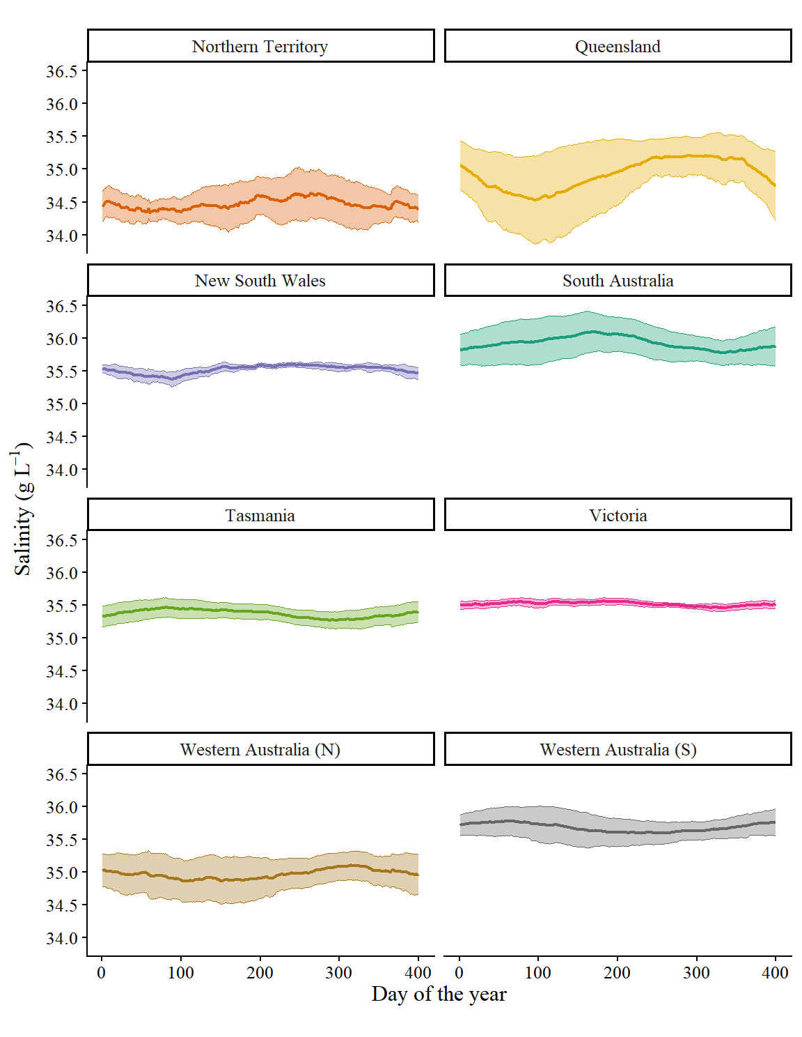
Figure S4: Salinity

Code to generate plot
S_input_state <- S_input %>%
  group_by(state, yday) %>% 
  reframe(value = mean(S_input, na.rm = T),
          sd = sd(S_input, na.rm = T))

p_input_state_av %+% S_input_state +
  scale_y_continuous(breaks = seq(30, 40, 0.5), limits = c(33.85, 36.5)) +
  labs(x = "Day of the year", y = expression("Salinity (g L"^-1*")"))
Figure 11: Summary of salinity values across the year within each state, averaged across 2019-2023 and all depths < 15 m. Bold lines show the mean across all cells within each state while ribbons show the standard deviation between cells.

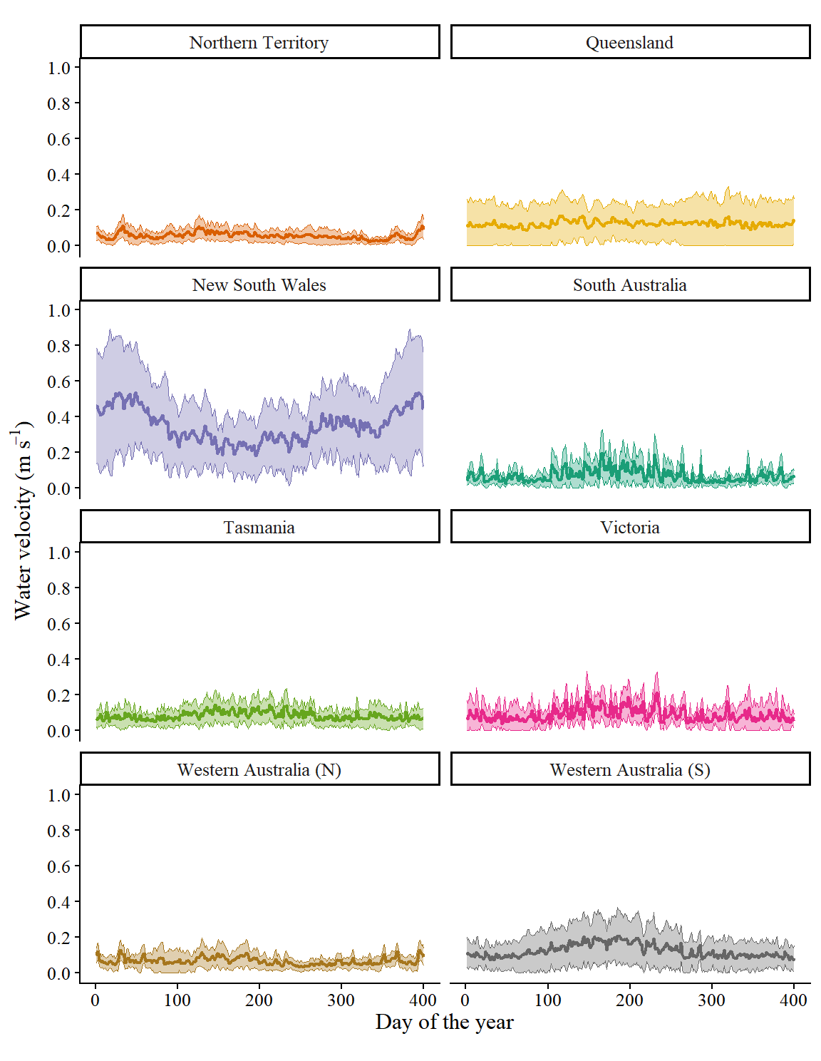
Figure S5: Water velocity

Code to generate plot
UV_input_state <- UV_input %>%
  group_by(state, yday) %>% 
  reframe(value = mean(UV_input, na.rm = T),
          sd = sd(UV_input, na.rm = T)) %>% 
  mutate(sd_min = case_when(sd > value ~ value, T ~ sd))

(
  p_input_state_av <- UV_input_state %>% 
    ggplot(aes(x = yday, y = value, ymin = value-sd_min, ymax = value+sd, colour = state, fill = state)) +
    geom_line(linewidth = 0.75) +
    geom_ribbon(alpha = 0.35, linewidth = 0.25) +
    facet_wrap(facets = vars(state), ncol = 2) +
    scale_y_continuous(breaks = seq(0, 1, 0.2), limits = c(-0.01, 1)) +
    scale_colour_manual(values = states_pal) +
    scale_fill_manual(values = states_pal) +
    env_plot_MS() +
    labs(x = "Day of the year", y = expression("Water velocity (m s"^-1*")"))
)
Figure 12: Summary of water velocity values across the year within each state, averaged across 2019-2023 and all depths < 15 m. Bold lines show the mean across all cells within each state while ribbons show the standard deviation between cells.

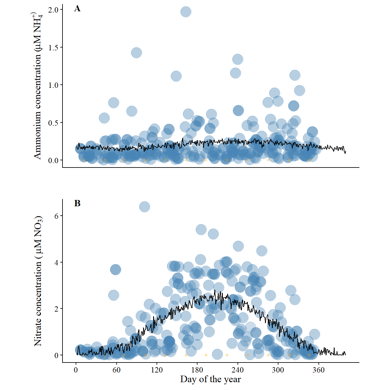
Figure S6: Example N input

Load N data for example cell
eg_cell <- 108843

BARRA_R2_cell_nos <- file.path(envi_data, "BARRA_R2_cell_nos.qs") %>% qs::qread()
ind <- which(BARRA_R2_cell_nos == eg_cell)

N_data <- find_read(file.path(envi_data, "combined_N_data"), "N_data_combined") %>% 
  filter(cell_no == eg_cell) %>% 
  mutate(value = value %>% set_units("mg m-3") %>% set_units("umol L-1") %>% drop_units())

N_curve <- find_read(file.path(envi_data, "combined_N_data"), "parameter") %>% 
  filter(cell_no == eg_cell) 
N_curve <- data.frame(yday = 1:365) %>% 
  mutate(ammonia = N_curve$a[N_curve$measure == "Am"] + N_curve$b[N_curve$measure == "Am"] * 
           sin((yday * pi + N_curve$c[N_curve$measure == "Am"]) / 182.5),
         nitrate_nitrite = N_curve$a[N_curve$measure == "Ni"] + N_curve$b[N_curve$measure == "Ni"] * 
           sin((yday * pi + N_curve$c[N_curve$measure == "Ni"]) / 182.5)) %>% 
  pivot_longer(names_to = "indicator", values_to = "value", cols = c("ammonia", "nitrate_nitrite"), 
               names_transform = list(indicator = as.factor)) %>% 
  mutate(value = value %>% set_units("mg m-3") %>% set_units("umol L-1"))

N_input <- file.path(envi_data, "cell_input_all") %>% 
  list.files(full.names = T) %>% 
  purrr::map(function(fnm){
    read_parquet(fnm) %>% 
      filter(cell_no == eg_cell)
  }) %>% 
  bind_rows() %>% 
  select(yday, Ni_input, Am_input) %>% 
  pivot_longer(names_to = "indicator", values_to = "value", cols = c("Ni_input", "Am_input"), 
               names_transform = list(indicator = as.factor)) %>% 
  mutate(value = value %>% set_units("mg m-3") %>% set_units("umol L-1") %>% drop_units(),
         indicator = factor(indicator, levels = c("Am_input", "Ni_input"), labels = levels(N_data$indicator)))
Code to generate plot
p1_df <- N_data %>% filter(indicator == "ammonia")
p1_df2 <- N_input %>% filter(indicator == "ammonia")
p2_df <- N_data %>% filter(indicator != "ammonia")
p2_df2 <- N_input %>% filter(indicator != "ammonia")

p1 <- p1_df %>% 
  ggplot(aes(x = yday, y = value, fill = data_source, colour = data_source, size = weight)) +
  geom_point(shape = 21, alpha = 0.15) +
  # facet_wrap(facets = vars(indicator), nrow = 2, scales = "free") +
  geom_line(data = p1_df2, aes(x = yday, y = value), inherit.aes = F) +
  scale_fill_manual(values = c("steelblue", "orange")) +
  scale_colour_manual(values = c("steelblue", "orange")) +
  # scale_y_continuous(limits = c(0, 3.5), breaks = seq(0, 4, 0.5)) +
  env_plot_MS() +
  theme(aspect.ratio = 0.55) +
  scale_x_continuous(breaks = seq(0,360,60)) +
  labs(x = "Day of the year", y = ammonium_lab)

p2 <- p2_df %>% 
  ggplot(aes(x = yday, y = value, fill = data_source, colour = data_source, size = weight)) +
  geom_point(shape = 21, alpha = 0.15) +
  # facet_wrap(facets = vars(indicator), nrow = 2, scales = "free") +
  geom_line(data = p2_df2, aes(x = yday, y = value), inherit.aes = F) +
  scale_fill_manual(values = c("steelblue", "orange")) +
  scale_colour_manual(values = c("steelblue", "orange")) +
  # scale_y_continuous(limits = c(0, 3.5), breaks = seq(0, 4, 0.5)) +
  env_plot_MS() +
  theme(aspect.ratio = 0.55, axis.title.y = element_text(vjust = 0.5)) +
  scale_x_continuous(breaks = seq(0,360,60)) +
  labs(x = "Day of the year", y = nitrate_lab)

plot_grid(
  p1 + tlabel("A") + rm.x(),
  p2 + tlabel("B"),
  nrow = 2, align = "hv"
)
Figure 13: An example of the daily ammonium (A) and nitrate (B) input and data for a single cell in New South Wales. Black lines show the input driving the growth model (constructed curve), blue points show data from the two nearest reference stations (Port Hacking and North Stradbroke Island) and orange dots show data from outfall points within 48 km (Bombo, Coniston Beach, Penguin Heads, and Shellharbour). Point size indicates the relative data weight (inverse distance from the cell centre) in curve construction. Note the different y-axes.

Figure S7: Nitrogen

Get nitrate input data
Ni_input <- file.path(envi_data, "cell_input_all") %>% 
  list.files(full.names = T) %>% 
  purrr::map(function(fnm) {
    fnm %>% arrow::read_parquet(col_select = c("cell_no", "state", "yday", "Ni_input"))
  }) %>% 
  bind_rows() %>% 
  mutate(state = factor(state, levels = states_ord, labels = states_lng)) %>% 
  mutate(Ni_input = Ni_input %>% set_units("mg m-3") %>% set_units("umol L-1"))
Code to generate plot
Ni_input_state <- Ni_input %>%
  group_by(state, yday) %>% 
  reframe(value = mean(Ni_input, na.rm = T),
          sd = sd(Ni_input, na.rm = T)) %>% 
  mutate(value = value %>% drop_units())

(
  p_input_state_av <- Ni_input_state %>% 
    ggplot(aes(x = yday, y = value, ymin = value-sd, ymax = value+sd, colour = state, fill = state)) +
    geom_line(linewidth = 0.75) +
    geom_ribbon(alpha = 0.35, linewidth = 0.25) +
    facet_wrap(facets = vars(state), ncol = 2) +
    # scale_y_continuous(breaks = seq(0, 40, 5), limits = c(10, 35)) +
    scale_colour_manual(values = states_pal) +
    scale_fill_manual(values = states_pal) +
    env_plot_MS() +
    labs(x = "Day of the year", y = nitrate_lab)
)
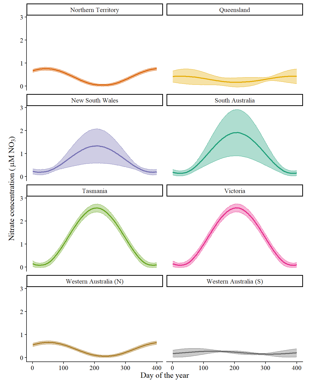
Figure 14: Summary of nitrate concentration values across the year within each state, averaged across 2019-2023. Bold lines show the mean across all cells within each state while ribbons show the standard deviation between cells.

Figure S8: Ammonium

Get ammonium input data
Am_input <- file.path(envi_data, "cell_input_all") %>% 
  list.files(full.names = T) %>% 
  purrr::map(function(fnm) {
    fnm %>% arrow::read_parquet(col_select = c("cell_no", "state", "yday", "Am_input"))
  }) %>% 
  bind_rows() %>% 
  mutate(state = factor(state, levels = states_ord, labels = states_lng)) %>% 
  mutate(Am_input = Am_input %>% set_units("mg m-3") %>% set_units("umol L-1"))
Code to generate plot
Am_input_state <- Am_input %>%
  group_by(state, yday) %>% 
  reframe(value = mean(Am_input, na.rm = T),
          sd = sd(Am_input, na.rm = T)) %>% 
  mutate(value = value %>% drop_units())

p_input_state_av %+% Am_input_state +
  # scale_y_continuous(breaks = seq(30, 40, 0.5), limits = c(34, 36.5)) +
  labs(x = "Day of the year", y = ammonium_lab)
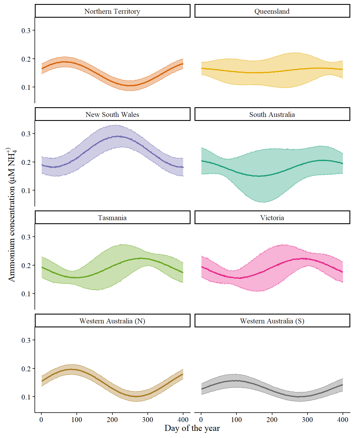
Figure 15: Summary of ammonium concentration values across the year within each state, averaged across 2019-2023. Bold lines show the mean across all cells within each state while ribbons show the standard deviation between cells.

Figure S9: Model sensitivity to parameter changes

Code
sens_arma <- file.path(spec_data, "sensitivity_arma_calc_combTU.parquet") %>% 
  read_parquet() %>% 
  dplyr::filter(!param %in% c("M_am", "C_am", "M_ot", "C_ot")) %>% 
  mutate(cult_dep = as.factor(cult_dep))
exlude <- unique(sens_arma$param[abs(sens_arma$sens) < 0.01]) %>% as.character
sens_arma <- sens_arma %>% 
  dplyr::filter(!param %in% c(exlude, "M_am", "C_am", "M_ot", "C_ot"))
sens_arma$param <- droplevels(sens_arma$param)

# levels(sens_arma$param)
# exlude

# Add axis labels
param.labs.arma <- c(
  bquote("V"["Am"]), 
  bquote("K"["Am"]),
  # bquote("M"["Ni"]),
  bquote("C"["Ni"]), 
  bquote("Q"["min"]), 
  bquote("Q"["max"]),
  # bquote("K"["c"]),
  bquote(mu), 
  bquote("D"["ve"]),
  # bquote("a"["cs"]), 
  # bquote("I"["o"]),
  bquote("T"["opt"]), 
  bquote("T"["min"]), 
  bquote("T"["max"])
  # bquote("S"["opt"]), 
  # bquote("S"["min"]), 
  # bquote("S"["max"]), 
  # bquote("h"["a"]), 
  # bquote("h"["b"]), 
  # bquote("h"["c"]), 
  # bquote("h"["max"]), 
  # "DW:WW"
)

sens_taxi <- file.path(spec_data, "sensitivity_taxi_calc_combTU.parquet") %>% 
  read_parquet() %>% 
  mutate(cult_dep = as.factor(cult_dep))
exlude <- unique(sens_taxi$param[abs(sens_taxi$sens) < 0.01]) %>% as.character
sens_taxi <- sens_taxi %>% 
  dplyr::filter(!param %in% c(exlude, "M_am", "C_am", "M_ot", "C_ot"))
sens_taxi$param <- droplevels(sens_taxi$param)

# levels(sens_taxi$param)
# exlude

# Add axis labels
param.labs.taxi <- param.labs.arma
Code to generate plot
p1_df <- sens_arma %>% filter(!is.na(sens) & cult_dep != "10")
p2_df <- sens_taxi %>% filter(!is.na(sens) & cult_dep != "10")

p1 <- p1_df %>% 
  ggplot(aes(x = rev(param), y = sens, fill = as.factor(cult_dep), ymin = sens-sd, ymax = sens+sd)) +
  geom_col(position = position_dodge(), width = 0.95, colour = "black") +
  geom_errorbar(position = position_dodge(width = 0.95), width = 0.5) +
  coord_flip() +
  scale_y_continuous(limits = c(-1.1, 1.1), breaks = seq(-1.5, 1.5, 0.2)) +
  scale_x_discrete(limits = levels(sens_arma$param), labels = rev(param.labs.arma)) +
  scale_fill_manual(values = depths_pal) +
  labs(y = "Total N sensitivity", x = "Parameter name") +
  prettyplot_MS() +
  theme(axis.title.x = element_blank(), 
        axis.text.x = element_blank(), 
        axis.ticks.x = element_blank(),
        aspect.ratio = 0.7)

p2 <- p2_df %>% 
  ggplot(aes(x = rev(param), y = sens, fill = as.factor(cult_dep), ymin = sens-sd, ymax = sens+sd)) +
  geom_col(position = position_dodge(), width = 0.95, colour = "black") +
  geom_errorbar(position = position_dodge(width = 0.95), width = 0.5) +
  coord_flip() +
  scale_y_continuous(limits = c(-1.1, 1.1), breaks = seq(-1.5, 1.5, 0.2)) +
  scale_x_discrete(limits = levels(sens_arma$param), labels = rev(param.labs.taxi)) +
  scale_fill_manual(values = depths_pal) +
  labs(y = "Total N sensitivity", x = "Parameter name") +
  prettyplot_MS() + 
  theme(aspect.ratio = 0.7)

plot_grid(
  p1 + tlabel("A", x = Inf, y = -1.1), 
  p2 + tlabel("B", x = Inf, y = -1.1), 
  nrow = 2, align = "hv"
)
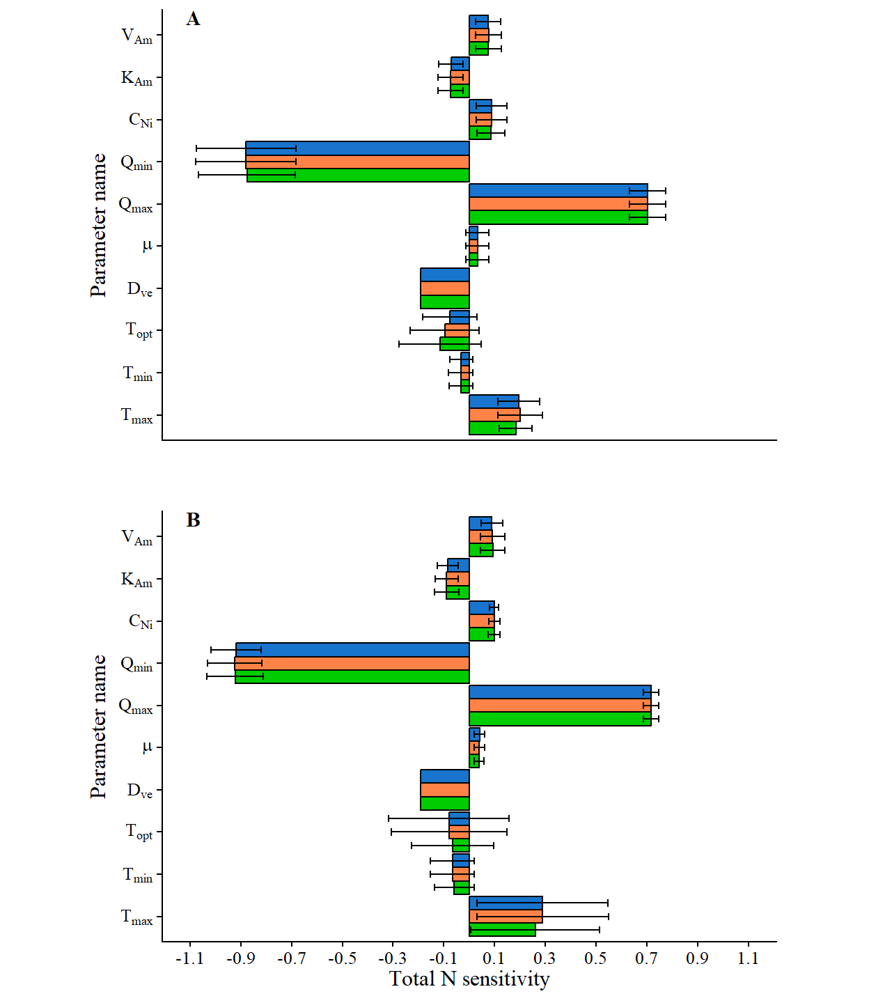
Figure 16: Relative impact of increasing each model parameter for Asparagopsis armata (A) and Asparagopsis taxiformis (B) by 10% on total N removed. Colours show the different culture depths of 0.5 m (orange), 2.5 m (blue), and 5 m (green) below the surface. Error bars show variability (SD) across the 12 months of a typical year in each state.

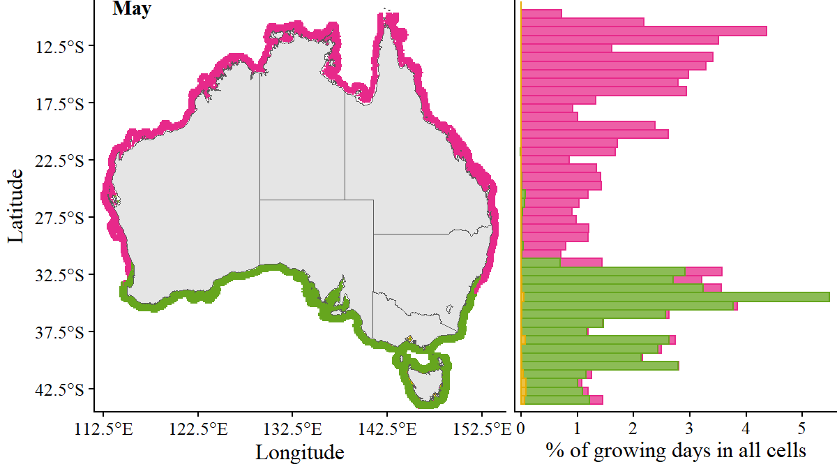
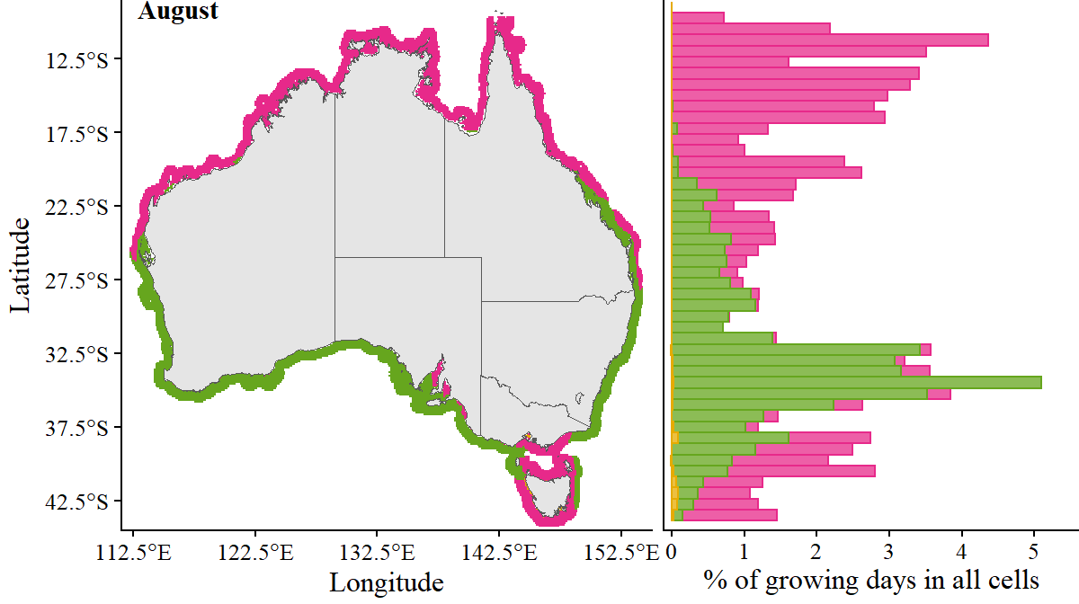
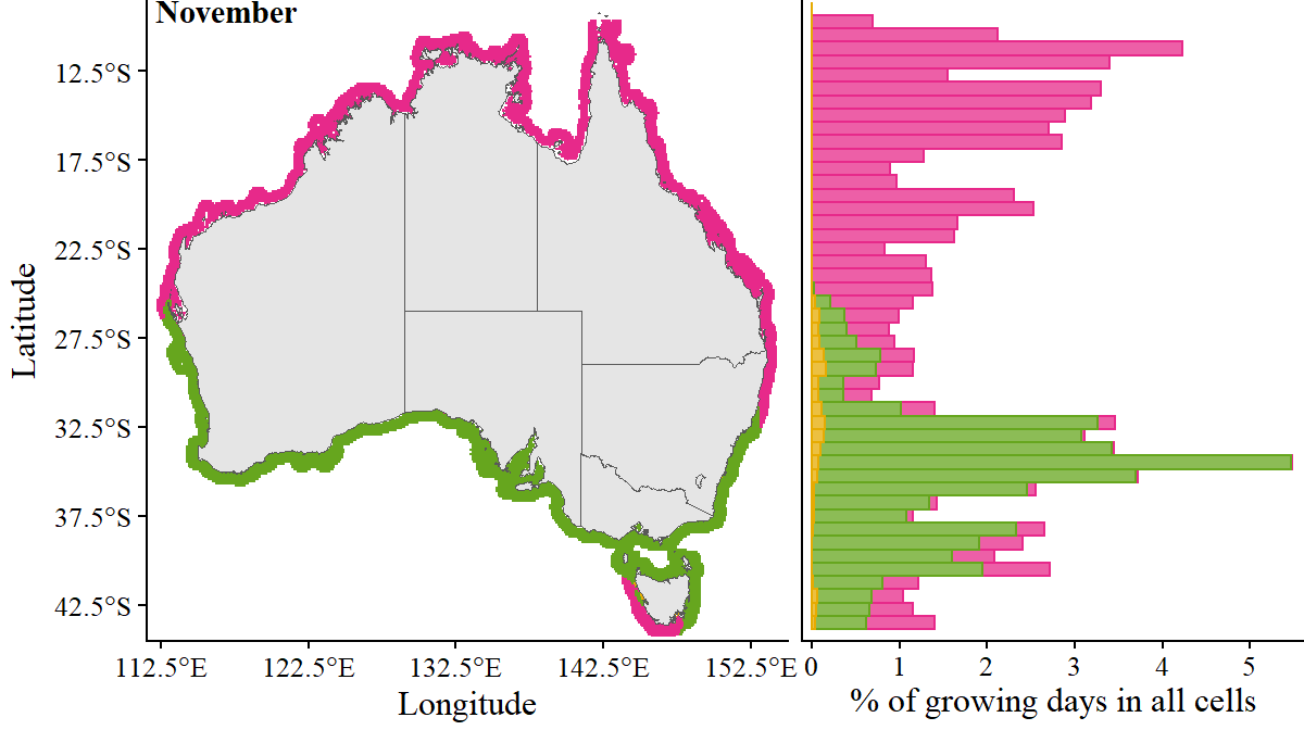
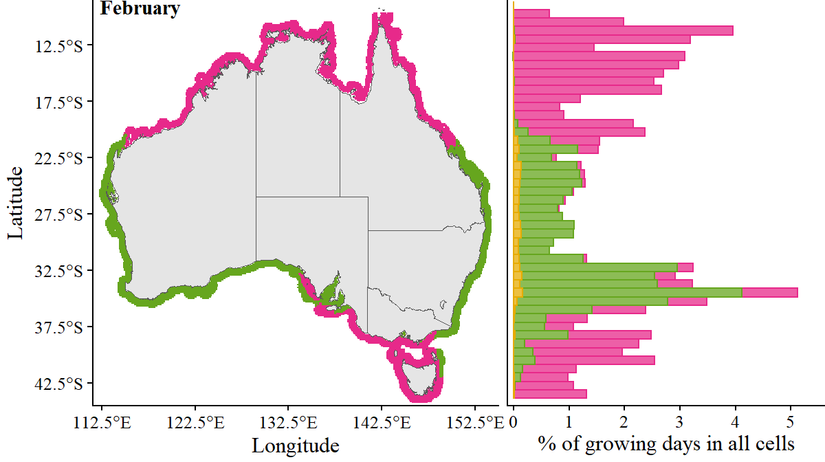
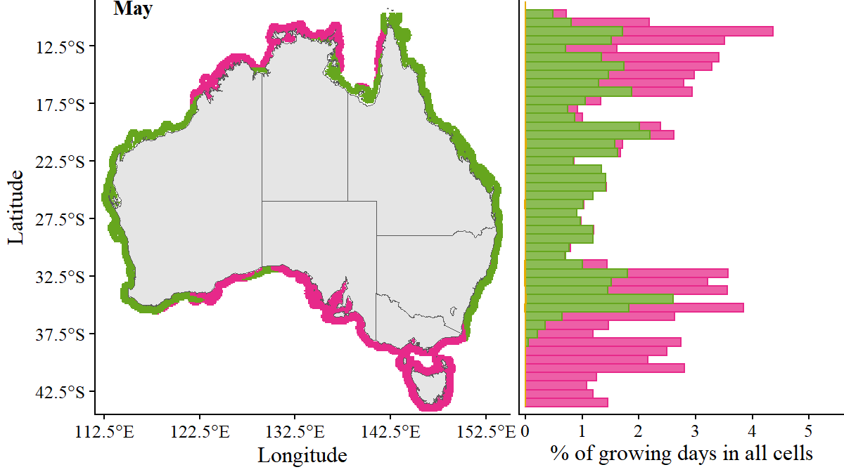
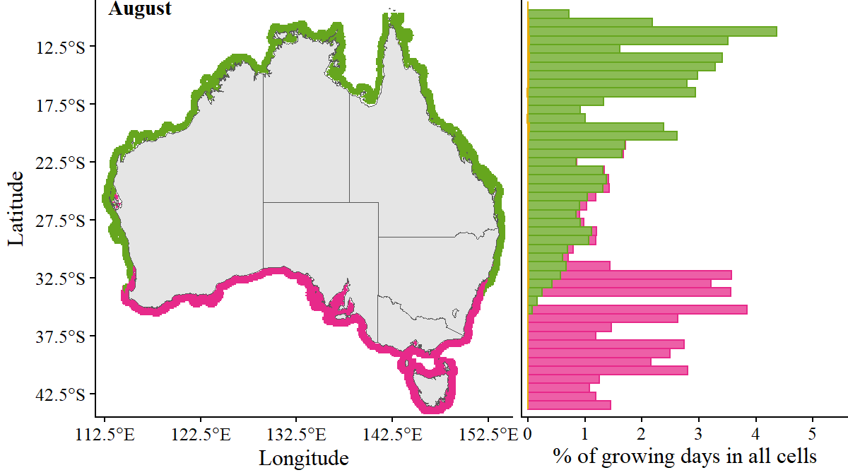
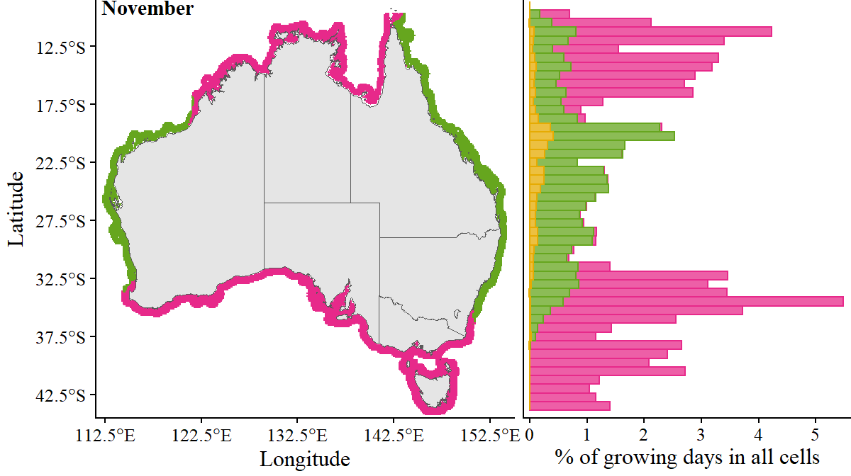
Figure S10: Factors limiting growth (A. armata)

Code
# This has cell_no, lat, lon, month and lims (for maps)
armata_lims <- map(1:12, function(m) {
  file.path(runs_data, str_c("armata_dom_lims_raster_", fixnum(m,2), ".tif")) %>% 
    terra::rast() %>% 
    as.data.frame(xy=TRUE) %>% 
    rename(longitude = x, latitude = y) %>% 
    mutate(lim = factor(lim, levels = 1:4, labels = c("T_lim", "I_lim", "Q_lim", "S_lim")))
  })

# This has only latitude, month and lim (for histograms)
forhist_armata <- find_read(runs_data, "forhist_armata.parquet") %>% split(.$month)
Code
p_dom_hist.1 <- forhist_armata[[1]] %>% 
  ggplot(aes(y = latitude, x = after_stat(100*count/(13207 * 30)), fill = lim, colour = lim)) +
  geom_histogram(position = "stack", alpha = 0.75, binwidth = 0.75) +
  scale_fill_manual(values = lims_pal) +
  scale_colour_manual(values = lims_pal) +
  scale_y_continuous(limits = c(-44.5, -8.5), expand = c(0,0)) +
  scale_x_continuous(limits = c(0, 5.5), breaks = seq(0, 5, 1), expand = c(0.02,0)) +
  labs(x = expression("% of growing days in all cells"), y = "Latitude") +
  prettyplot_MS() +
  rm.y() + 
  theme(plot.margin = margin(0, 0, 0, 0, "pt"), panel.spacing = unit(1, "lines"))

p_dom_map.1 <- armata_lims[[1]] %>% 
  ggplot(aes(x = longitude, y = latitude, fill = lim)) +
  geom_raster() +
  geom_sf(data = ozmap_data(data = "states"), inherit.aes = F) +
  coord_sf(xlim = c(111.5, 155), ylim = c(-44.5, -8.5), expand = F) +
  scale_x_continuous(breaks = seq(112.5, 160, 10)) +
  scale_y_continuous(breaks = seq(-2.5, -45, -5)) +
  scale_color_brewer(palette = "Dark2") +
  scale_fill_manual(values = lims_pal) +
  labs(x = "Longitude", y = "Latitude") +
  prettyplot_MS() + 
  theme(plot.margin = margin(0, 0, 0, 0, "pt"), axis.title.x = element_text(vjust = 1))
Code to generate plot
plot_grid(
  p_dom_map.1 %+% armata_lims[[2]] + tlabel(month.name[2], x = 114.5),
  p_dom_hist.1 %+% forhist_armata[[2]],
  ncol = 2, 
  align = "h", 
  rel_widths = c(1, 0.625)
)  

plot_grid(
  p_dom_map.1 %+% armata_lims[[5]] + tlabel(month.name[5], x = 114.5),
  p_dom_hist.1 %+% forhist_armata[[5]],
  ncol = 2, 
  align = "h", 
  rel_widths = c(1, 0.625)
)

plot_grid(
  p_dom_map.1 %+% armata_lims[[8]] + tlabel(month.name[8], x = 114.5),
  p_dom_hist.1 %+% forhist_armata[[8]],
  ncol = 2, 
  align = "h", 
  rel_widths = c(1, 0.625)
)

plot_grid(
  p_dom_map.1 %+% armata_lims[[11]] + tlabel(month.name[11], x = 114.5),
  p_dom_hist.1 %+% forhist_armata[[11]],
  ncol = 2, 
  align = "h", 
  rel_widths = c(1, 0.625)
)
Figure 17
Figure 18
Figure 19
Figure 20

Figure S11: Factors limiting growth (A. taxiformis)

Code
# This has cell_no, lat, lon, month and lims (for maps)
taxiformis_lims <- map(1:12, function(m) {
  file.path(runs_data, str_c("taxiformis_dom_lims_raster_", fixnum(m,2), ".tif")) %>% 
    terra::rast() %>% 
    as.data.frame(xy=TRUE) %>% 
    rename(longitude = x, latitude = y) %>% 
    mutate(lim = factor(lim, levels = 1:4, labels = c("T_lim", "I_lim", "Q_lim", "S_lim")))
  })

# This has only latitude, month and lim (for histograms)
forhist_taxiformis <- find_read(runs_data, "forhist_taxiformis.parquet") %>% split(.$month)
Code to generate plot
plot_grid(
  p_dom_map.1 %+% taxiformis_lims[[2]] + tlabel(month.name[2], x = 114.5),
  p_dom_hist.1 %+% forhist_taxiformis[[2]],
  ncol = 2, 
  align = "h", 
  rel_widths = c(1, 0.625)
)  

plot_grid(
  p_dom_map.1 %+% taxiformis_lims[[5]] + tlabel(month.name[5], x = 114.5),
  p_dom_hist.1 %+% forhist_taxiformis[[5]],
  ncol = 2, 
  align = "h", 
  rel_widths = c(1, 0.625)
)  

plot_grid(
  p_dom_map.1 %+% taxiformis_lims[[8]] + tlabel(month.name[8], x = 114.5),
  p_dom_hist.1 %+% forhist_taxiformis[[8]],
  ncol = 2, 
  align = "h", 
  rel_widths = c(1, 0.625)
)  

plot_grid(
  p_dom_map.1 %+% taxiformis_lims[[11]] + tlabel(month.name[11], x = 114.5),
  p_dom_hist.1 %+% forhist_taxiformis[[11]],
  ncol = 2, 
  align = "h", 
  rel_widths = c(1, 0.625)
)  
Figure 21
Figure 22
Figure 23
Figure 24